


Here you can see live demonstration of Side Menu with icons and rich text in RTL layout.
Side Menu is very unique vertical menu with slide-out panels. This menu is extremely efficient when you have complex navigation with a lot of menu items.
To setup Side Menu you just need to configure module parameter “Menu Class Suffix” appropriately and the menu system will take care of the rest. There are very detailed instructions in template documentation.
Side Menu with Icons and Rich Text
Side Menu can present menu items with icons and descriptive text, pretty much like Main Menu.
To setup icons you need to configure menu items appropriately just like Main Menu. There are very detailed instructions in template documentation.
Sunday, July 11, 2021
11:30 AM
Mission Statement
The mission of Decatur Bible Chapel is to EXALT the Lord Jesus Christ in worship, EXPOUND his Word through discipleship, EXPAND his kingdom through evangelism, ENCOURAGE the body through fellowship and to EQUIP the church for ministry .
Order of Services
Communion Service
Welcome &Announcements
Preaching Service
- Praise &Worship
- Prayer
- Musical Selection
- Message
- Benediction
Recurring Meetings : ( Go to DBCBeacon.org for additional information)
Tuesday : Prayer Meeting/Bible Study @ 7:30 PM
2 nd Friday of each month : Men ’s Prayer Meeting @ 8:00 PM
ELDERS: PHONE #:
Bro. Errol Brown 781-888-2449
Bro. Alvin Grant 770-879-9768
Bro. F. Ronnie Hart 770-396-5829
Bro. Michael Hart 770-564-8677
Bro. Basil Smith 770-413-7967
At the top of this page, you can see live demonstration of Top Menu.
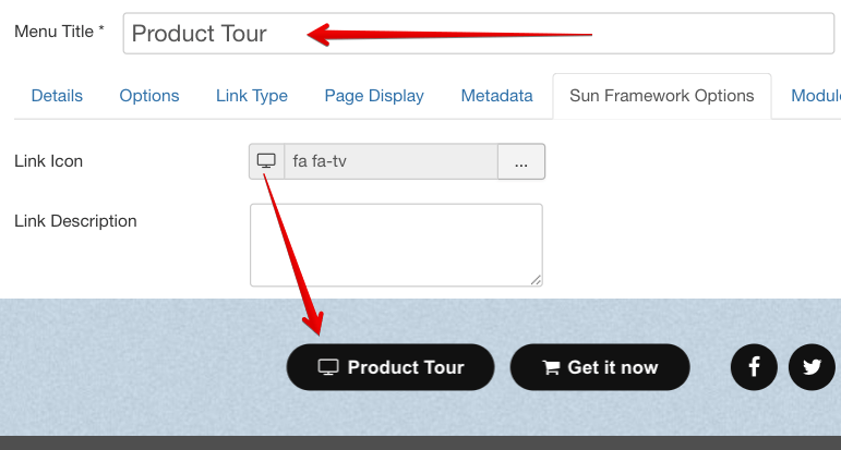
Top Menu allows you to arrange menu items in horizontal line and assign icons to them. All icons are configured directly in menu item settings page which is very convenient.
You can choose up to 28 predefined icons to menu item.
Here you can see live demonstration of Tree Menu.
Tree Menu represents menu items in clear tree-like hierarchy, which is very appropriate for indexing menu. By default all submenu items are collapsed until you select the parent menu item.
To setup Tree Menu you just need to configure module parameter “Menu Class Suffix” appropriately and the menu system will take care of the rest.
Lorem ipsum
Lorem ipsum dolor sit amet, consectetur adipiscing elit. Cras non lorem libero. Vestibulum a leo ac tortor congue euismod. Nam sed nulla tellus. Suspendisse ut hendrerit justo. Sed molestie vestibulum nisl, a sodales urna molestie nec. Etiam neque nisl, malesuada ut egestas ut, facilisis vel leo. Morbi gravida blandit porttitor. Phasellus sed diam ante, quis lobortis tortor. Nunc quis mi congue ipsum fringilla hendrerit nec eget magna.
Lorem ipsum
Quisque sed mi non risus egestas cursus. Aenean odio mi, rhoncus sit amet tincidunt placerat, pellentesque ac mi. Mauris est lectus, faucibus vel ultrices eget, lobortis vitae lorem. Nam non nisl vel lorem pulvinar pharetra quis nec augue. Sed in odio lorem. In hac habitasse platea dictumst. Pellentesque elementum, ipsum vel sollicitudin porttitor, felis augue pharetra erat, ut vestibulum dui turpis sed nulla. Suspendisse ac nulla nisi. Fusce sed est a leo gravida bibendum non non odio. Maecenas et tortor sit amet dolor sagittis scelerisque sed sit amet lectus. Suspendisse sollicitudin suscipit velit, eu pellentesque tortor tristique a. Aliquam ut velit dolor, quis convallis orci. Curabitur tincidunt aliquam tellus id tempor. Etiam iaculis erat id metus placerat eget lacinia est eleifend. Ut in interdum mi.
JSN Mico 2 was developed with extreme focus on typography and we believe it provides the most comprehensive content presentation capability. Headings, text, links, tables, images, everything was designed with high level of refinement. Let's take a look.
Headings
This is an H1 Header
Lorem ipsum dolor sit amet consectetuer eleifend elit vel tellus laoreet. At ut pellentesque risus quis sem eros et consequat enim lorem. Aenean lorem consequat consequat eu.
This is an H3 Header
Lorem ipsum dolor sit amet consectetuer eleifend elit vel tellus laoreet. At ut pellentesque risus quis sem eros et consequat enim lorem. Aenean lorem consequat consequat eu.
This is an H5 Header
Lorem ipsum dolor sit amet consectetuer eleifend elit vel tellus laoreet. At ut pellentesque risus quis sem eros et consequat enim lorem. Aenean lorem consequat consequat eu.
This is an H2 Header
Lorem ipsum dolor sit amet consectetuer eleifend elit vel tellus laoreet. At ut pellentesque risus quis sem eros et consequat enim lorem. Aenean lorem consequat consequat eu.
This is an H4 Header
Lorem ipsum dolor sit amet consectetuer eleifend elit vel tellus laoreet. At ut pellentesque risus quis sem eros et consequat enim lorem. Aenean lorem consequat consequat eu.
This is an H6 Header
Lorem ipsum dolor sit amet consectetuer eleifend elit vel tellus laoreet. At ut pellentesque risus quis sem eros et consequat enim lorem. Aenean lorem consequat consequat eu.
h1. Bootstrap heading
h2. Bootstrap heading
h3. Bootstrap heading
h4. Bootstrap heading
h5. Bootstrap heading
h6. Bootstrap heading
Blockquotes
Default Blockquote
You can us this style to quote somebody's speech, idea or a fragment from some book, articles, etc. Lorem ipsum dolor sit amet consectetuer eleifend elit vel tellus laoreet. At ut pellentesque risus quis sem eros et consequat enim lorem. Aenean lorem consequat consequat eu.
Usage: <blockquote>This is your quote</blockquote>
Highlighted Text
You can use this style to highlight important words and / or keyword expression in search result page. Lorem ipsum dolor sit amet consectetuer eleifend elit vel tellus laoreet. At ut pellentesque risus quis sem eros et consequat enim lorem. Aenean lorem consequat consequat eu.
Usage: <span class="text-highlight">This is the text to be highlighted.</span>
Alerts
Bootstrap provides an easy way to create predefined alert messages:
Success! You should read this message.
Info! You should read this message.
Warning! You should read this message.
Danger! You should read this message.
Closing Alerts
To close the alert message, add a .alert-dismissable class to the alert container. Then add class="close" and data-dismiss="alert" to a link or a button element (when you click on this the alert box will disappear).
Animated Alerts
To close the alert message, add a .alert-dismissable class to the alert container. Then add class="close" and data-dismiss="alert" to a link or a button element (when you click on this the alert box will disappear).
Link Styles
Link Icon Styles
You can attach up to 28 predefined icons to the front of any link by adding simple class to it.
- Link with article icon
- Link with calendar icon
- Link with cart icon
- Link with comment icon
- Link with display icon
- Link with star icon
- Link with folder icon
- Link with home icon
- Link with image icon
- Link with info icon
- Link with mail icon
- Link with rss icon
- Link with search icon
- Link with selection icon
- Link with help icon
- Link with database icon
- Link with check icon
- Link with calculator icon
- Link with edit icon
- Link with arrows icon
- Link with download icon
- Link with flag icon
- Link with diamond icon
- Link with users icon
- Link with level-up icon
- Link with remove icon
- Link with reply icon
- Link with love icon
This is link to download something.
Usage: <a class="link-icon jsn-icon-xxx">This is link text.</a>, where xxx is the name of icon to be applied. Detailed information about all icon names can be found in template documentation.
Example: <a class="link-icon jsn-icon-download">This is link to download something.</a>
Link Button Styles
JSN Mico 2 offers 12 button styles to decorate any call-to-action links you have in the content.
Usage: <a class="link-button button-xxx">This is link text.</a>, where xxx is the button color name selected from: light, dark, green, orange, blue and red.
Example: <a class="link-button button-orange">See plans & pricing.</a>
Table Styles
Plain Rows table style
| Table header | Column header 1 | Column header 2 | Column header 3 |
|---|---|---|---|
| Row header 1 | Lorem ipsum | Dolor sit amet | Lorem ipsum |
| Row header 1 | Lorem ipsum | Dolor sit amet | Lorem ipsum |
| Row header 1 | Lorem ipsum | Dolor sit amet | Lorem ipsum |
| Row header 1 | Lorem ipsum | Dolor sit amet | Lorem ipsum |
| Row header 1 | Lorem ipsum | Dolor sit amet | Lorem ipsum |
| Table footer | Footer data | ||
Color Stripes table style
| Table header | Column header 1 | Column header 2 | Column header 3 |
|---|---|---|---|
| Row header 1 | Lorem ipsum | Dolor sit amet | Lorem ipsum |
| Row header 1 | Lorem ipsum | Dolor sit amet | Lorem ipsum |
| Row header 1 | Lorem ipsum | Dolor sit amet | Lorem ipsum |
| Row header 1 | Lorem ipsum | Dolor sit amet | Lorem ipsum |
| Row header 1 | Lorem ipsum | Dolor sit amet | Lorem ipsum |
| Table footer | Footer data | ||
List styles
Standard list styles
Unordered list
- Lorem ipsum dolor sit amet
- Consetetur sadipscing elitr
- Sed diam voluptua
Ordered list
- Lorem ipsum dolor sit amet
- Consetetur sadipscing elitr
- Sed diam voluptua
Arrow list styles
Red arrow
- Lorem ipsum dolor sit amet
- Consetetur sadipscing elitr
- Sed diam voluptua
Blue arrow
- Lorem ipsum dolor sit amet
- Consetetur sadipscing elitr
- Sed diam voluptua
Green arrow
- Lorem ipsum dolor sit amet
- Consetetur sadipscing elitr
- Sed diam voluptua
Icon list styles
Article icon list
- Lorem ipsum dolor sit amet
- Consetetur sadipscing elitr
- Sed diam voluptua
Folder icon list
- Lorem ipsum dolor sit amet
- Consetetur sadipscing elitr
- Sed diam voluptua
Image icon list
- Lorem ipsum dolor sit amet
- Consetetur sadipscing elitr
- Sed diam voluptua
Online icon list
- Lorem ipsum dolor sit amet
- Consetetur sadipscing elitr
- Sed diam voluptua
Star icon list
- Lorem ipsum dolor sit amet
- Consetetur sadipscing elitr
- Sed diam voluptua
User icon list
- Lorem ipsum dolor sit amet
- Consetetur sadipscing elitr
- Sed diam voluptua
You can assign any of predefined 20 icons to list items. 6 icons shown above are just samples.
Number list styles
Blue Bullet number list
- 1Lorem ipsum dolor sit amet
- 2Consetetur sadipscing elitr
- 3Sed diam voluptua
Green Bullet number list
- 1Lorem ipsum dolor sit amet
- 2Consetetur sadipscing elitr
- 3Sed diam voluptua
Red Bullet number list
- 1Lorem ipsum dolor sit amet
- 2Consetetur sadipscing elitr
- 3Sed diam voluptua
Blue Digit number list
- 1Lorem ipsum dolor sit amet
- 2Consetetur sadipscing elitr
- 3Sed diam voluptua
Green Digit number list
- 1Lorem ipsum dolor sit amet
- 2Consetetur sadipscing elitr
- 3Sed diam voluptua
Red Digit number list
- 1Lorem ipsum dolor sit amet
- 2Consetetur sadipscing elitr
- 3Sed diam voluptua