


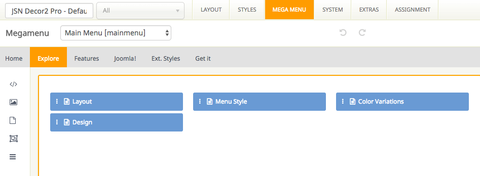
Mega menu is a perfect choice for creating unique large menus since it has been a new and growing web design trend lately. Regular drop-down menus only show text alone or text and icons vertically in a single column. However, mega menus are able to show all the options in one large panel, so visitors can easily reach most pages no matter where they are.
All JSN templates allow you to create a mega menu for site navigation and usability enhancement. They provide a visual way to create a mega menu with clicks and drag-n-drop function, without touching a single line of code.
Support multiple types of content
Our Megamenu allows you to display a lot of content in menu item such as text, images and videos in multiple columns. You can choose one of 3 element types including Joomla module, Submenu and Position to present your content in Megamenu.
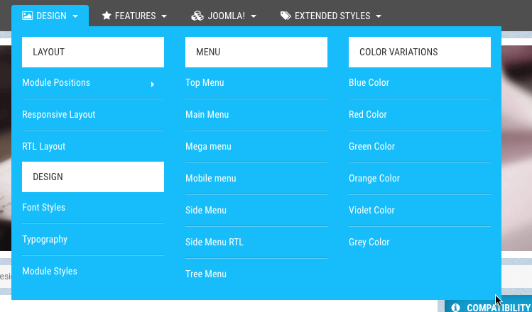
Easy to use
With JSN templates, all settings can be done via template parameters in the section Megamenu. You can find it easy to build the skeleton and add elements to make the content of mega menu based upon your need with no coding skills required.
This module displays a menu on the site (frontend). Â Menus can be displayed in a wide variety of ways by using the menu options and css menu styles. Help
Decatur Bible Chapel Ministries
Sunday School
Children’s Church
VBS
Youth Services
DBC Beacon
Women’s Ministry
Men’s Ministry
Singles Ministry
Missions
Short Term
Long Term
Local Outreach
Evangelism
DBC Soup Kitchen/Food Pantry
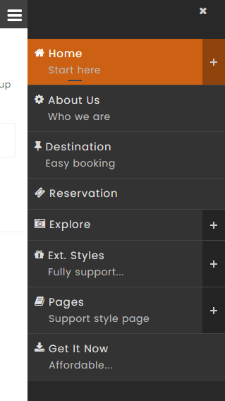
All JoomlaShine templates come with a responsive design to make sure that your website will look beautiful not only on all major web browsers but also on mobile devices.
We also offer a mobile version of the main menu to enhance the mobile user experience. There are 4 types of mobile menu to choose simply by a few clicks via administrator:
Sticky Mobile Menu
Sticky mobile menu allows your users landing on your site using a mobile device easily access to your menu from anywhere on the website, without having to scroll back to the top of the page. By default, sticky menu is automatically enabled for both mobile and desktop devices in Menu & Site Tools section.

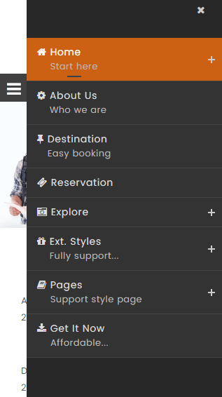
Default Mobile Menu
This is the default mobile menu style showing the menu in full-width form under the toolbar.
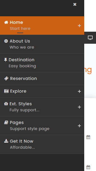
Mobile Menu with Push Effect
The mobile menu will appear from the left/right while website content will be pushed to the same direction.
Push Right
Push Left
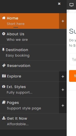
Mobile Menu with Slide Effect
The mobile menu will slide in from the left/right and overlap website content.
Slide Right
Slide Left
This Module shows a list of the currently published Articles which have the highest number of page views. Help
